
Objective: Multi-pack product packaging for both outer casing and contents.
Starting with research and exploration of multi-pack products and packaging, the 4-pack of Starbucks Frappuccino bottles was chosen as the base to redesign. The concept was a protein coffee drink with the brand being energetic and bold, appealing to gym-goers and busy individuals. After creating a mood-board, product profile, and sketches, I moved forward digitally with the top two approaches.

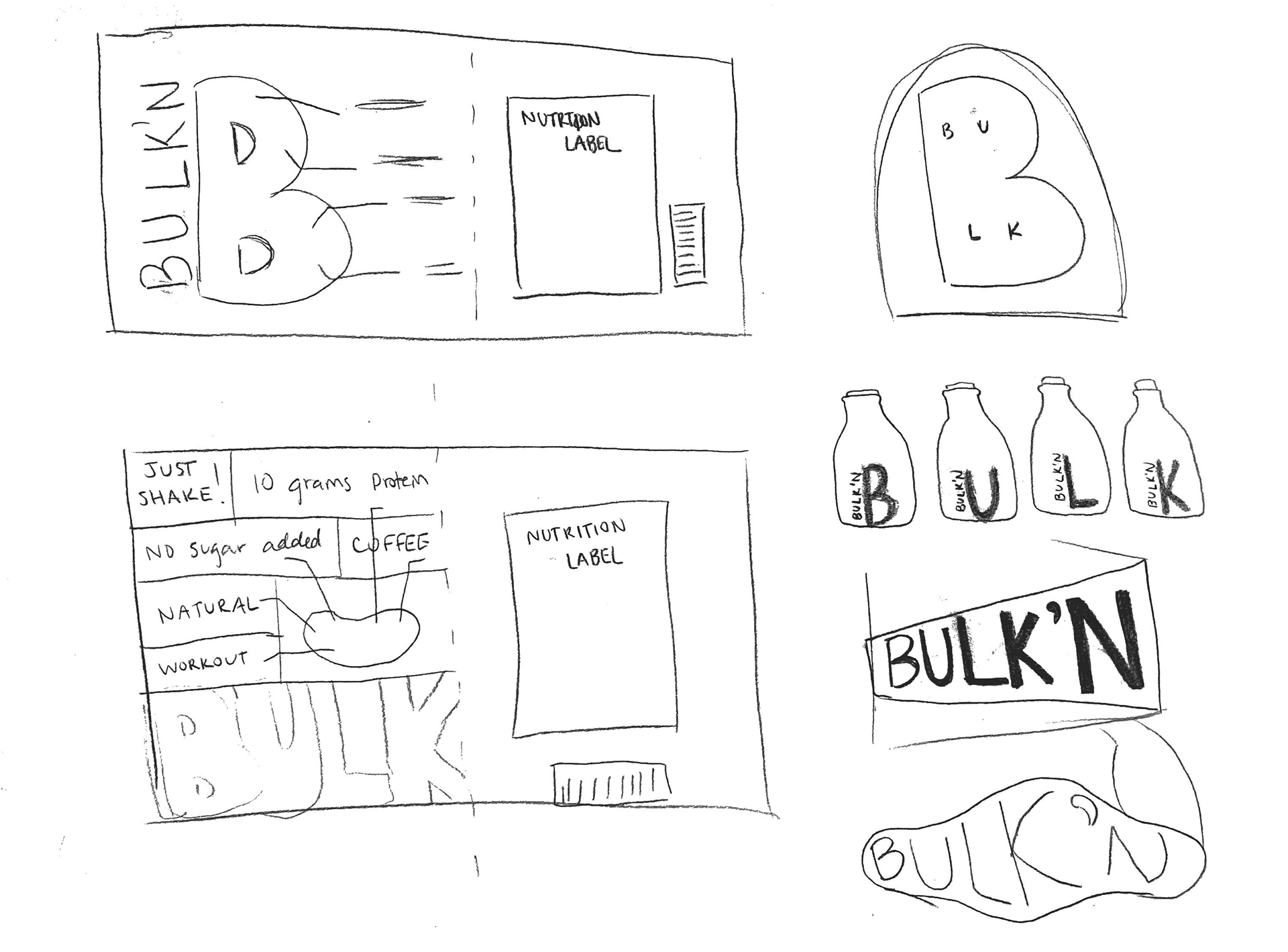

Choosing a concept: The biggest struggle with the first concept was the singular letters on each bottle. There would be too much of a disconnect for the audience if a bottle were to stand alone. Additionally, the wrap on the box did not allow for the brand name to be displayed fully on the shelf. It was interesting to play with these bright colors and see how they could interact with each other, but ultimately there were too many variables that did not fitting together. A pivot would have been necessary to make this design work for shelf life and identity when items are separated.

Concept 1 labels
Concept 1 labels mocked up
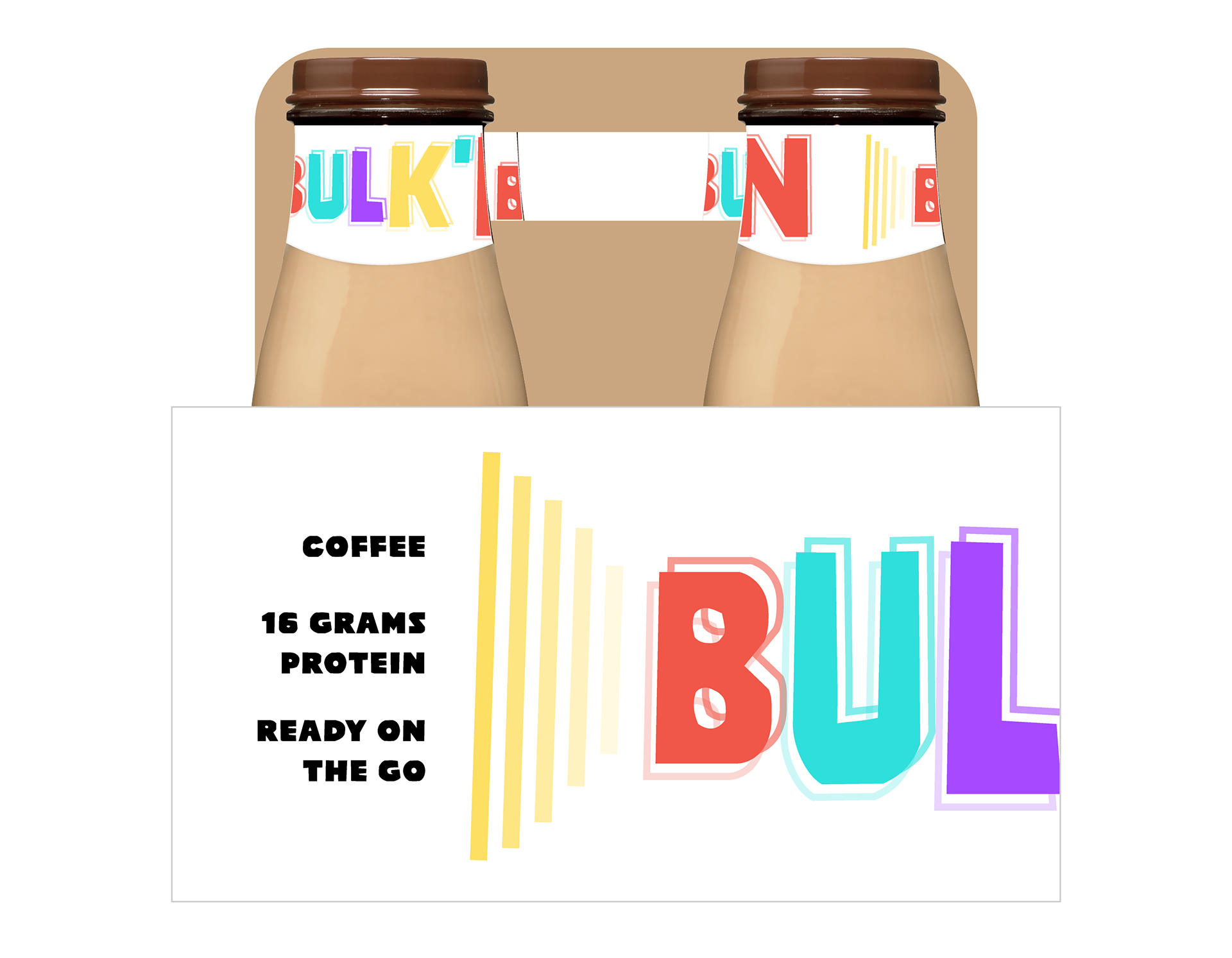
Concept 1 box

Concept 1 box mocked up
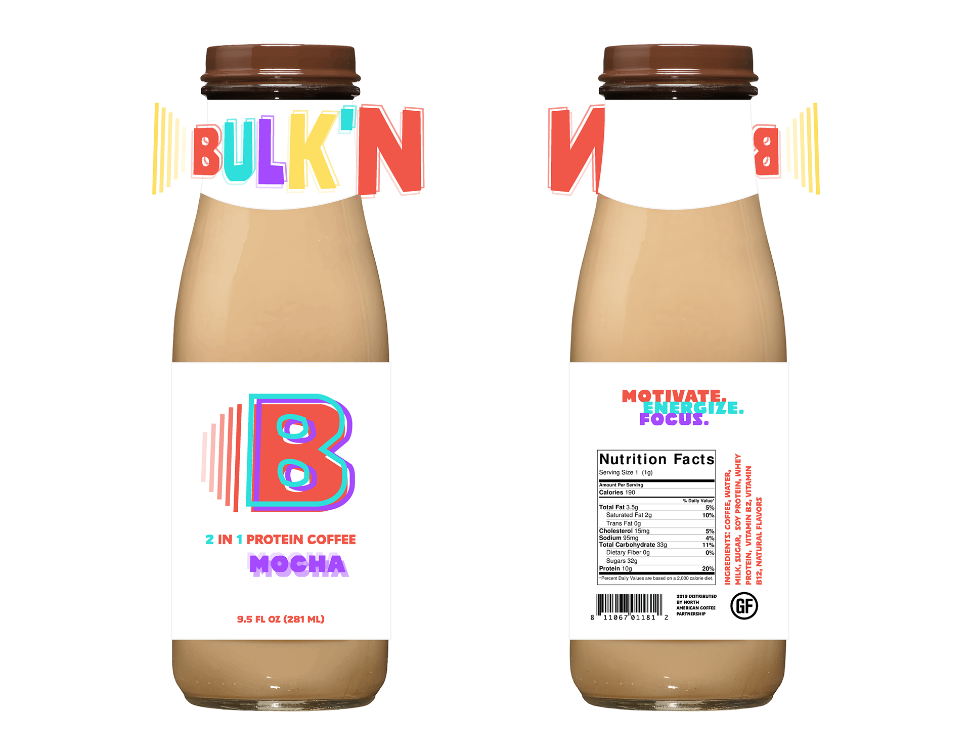
FINAL THOUGHTS: With my second (final) design, I was able to maintain the bold, energetic personality with a cleaner and simpler approach. This had the right balance of color and design elements to be interesting but not overwhelming. Utilizing a full logo/brand name across each product and casing assured a stronger connection to consumers. Additional callouts and nutrition facts boost this interest as well. A main goal was to balance a clean layout with enough information to draw in the targeted audience. Without the opportunity to physically mock up the product, I entered the world of digital mock-ups!
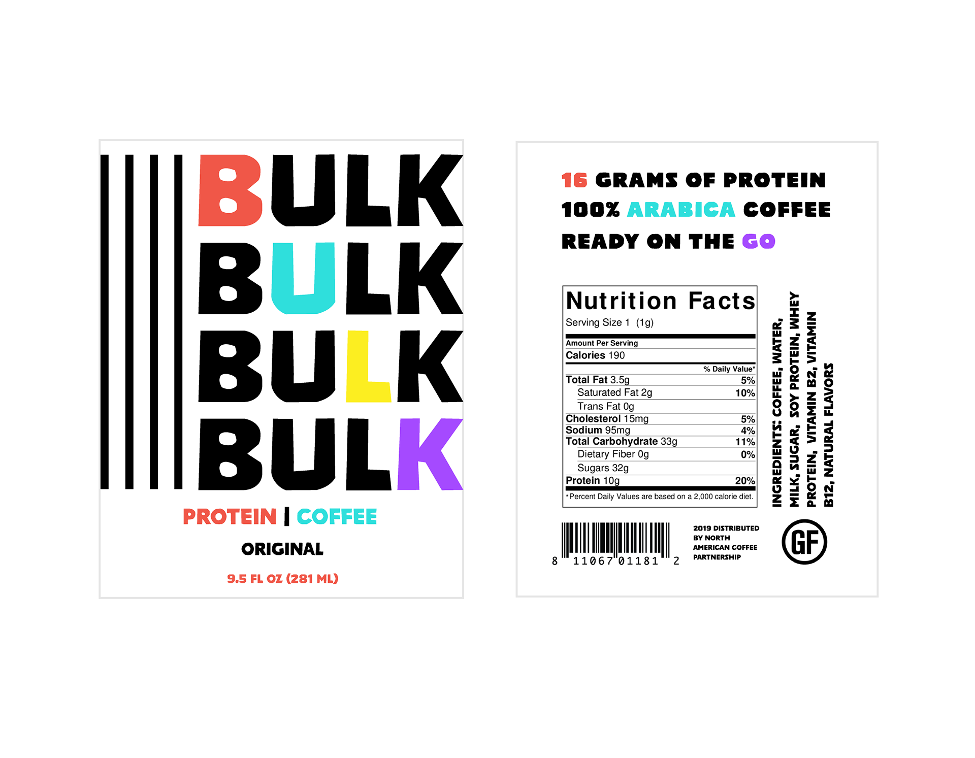
Concept 2 labels
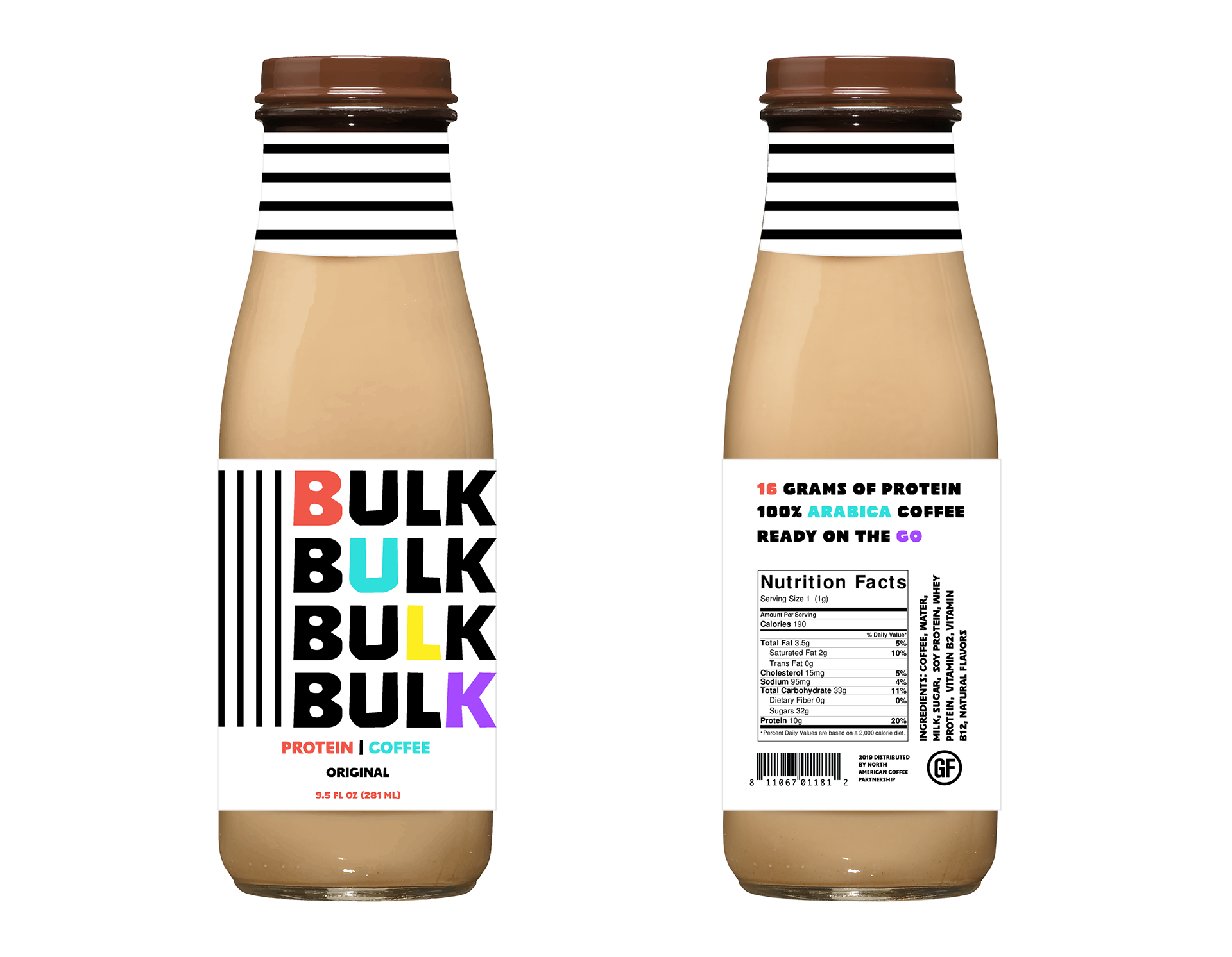
Concept 2 labels mocked up
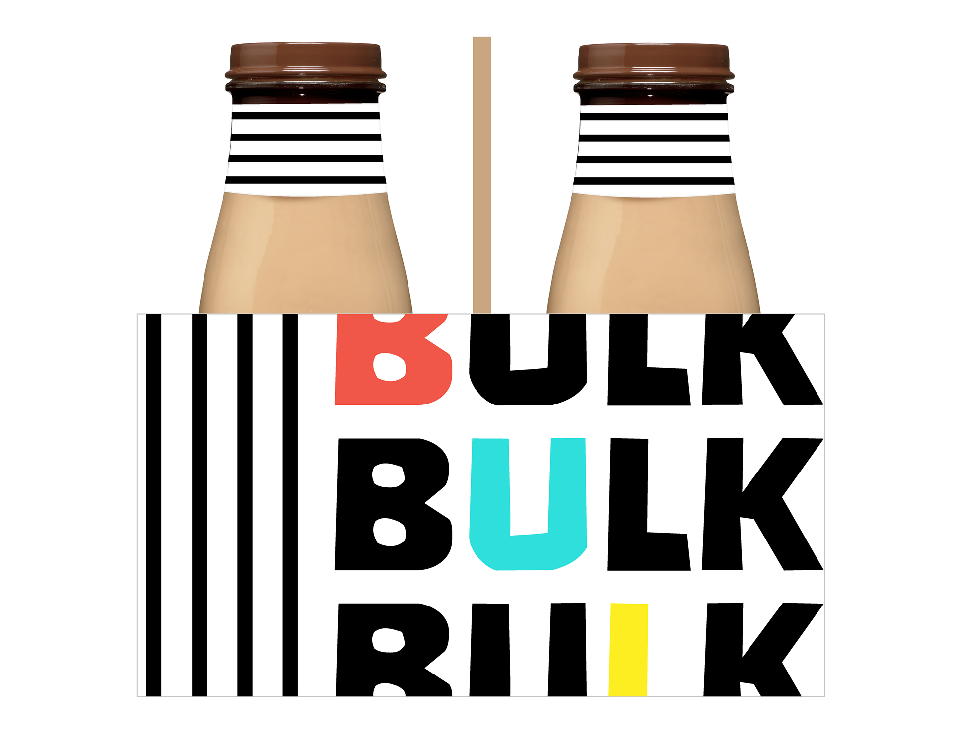
Concept 2 box
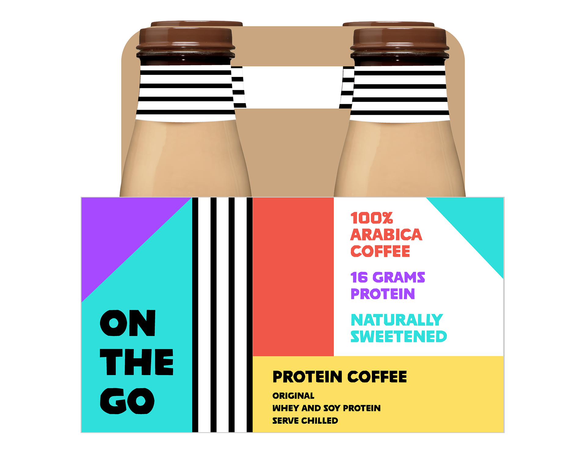
Concept 2 box mocked up