
Objective: Re-design the existing website to better exhibit the Cardigan Donuts brand and create a better user experience for customers to order online for pickup or delivery.
Old Cardigan Donuts website
Equity Evaluation: The existing website was processed through Shopify, and only allowed customers to order donut boxes online. Additional issues of brand identity, extraneous pages/content, inconsistent design style, and accessibility concerns, made it clear we needed to start with a clean slate. After dissecting the existing website, we were able to divide out which elements were important to transfer and which were not adding value to the user. This helped to provide a skeleton for the navigation. It was important to take into account all the needs and wants of both the user and Cardigan Donuts as an establishment.
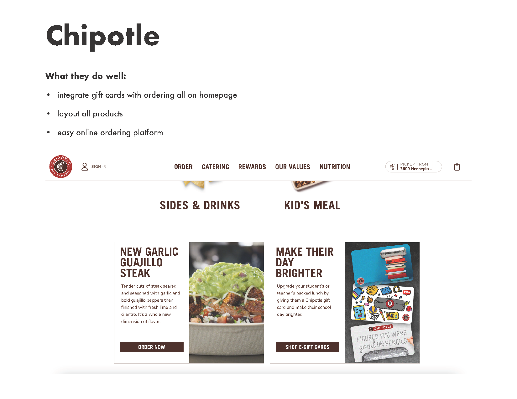
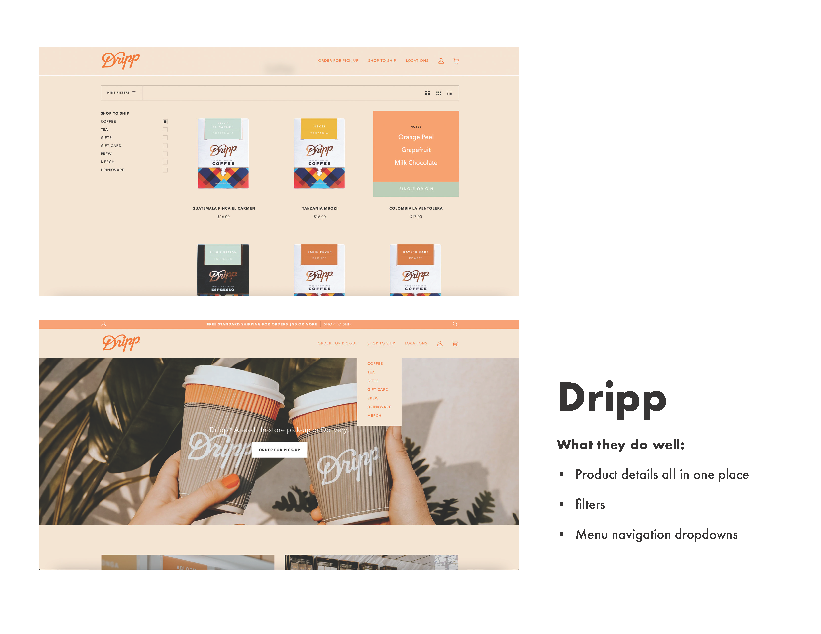
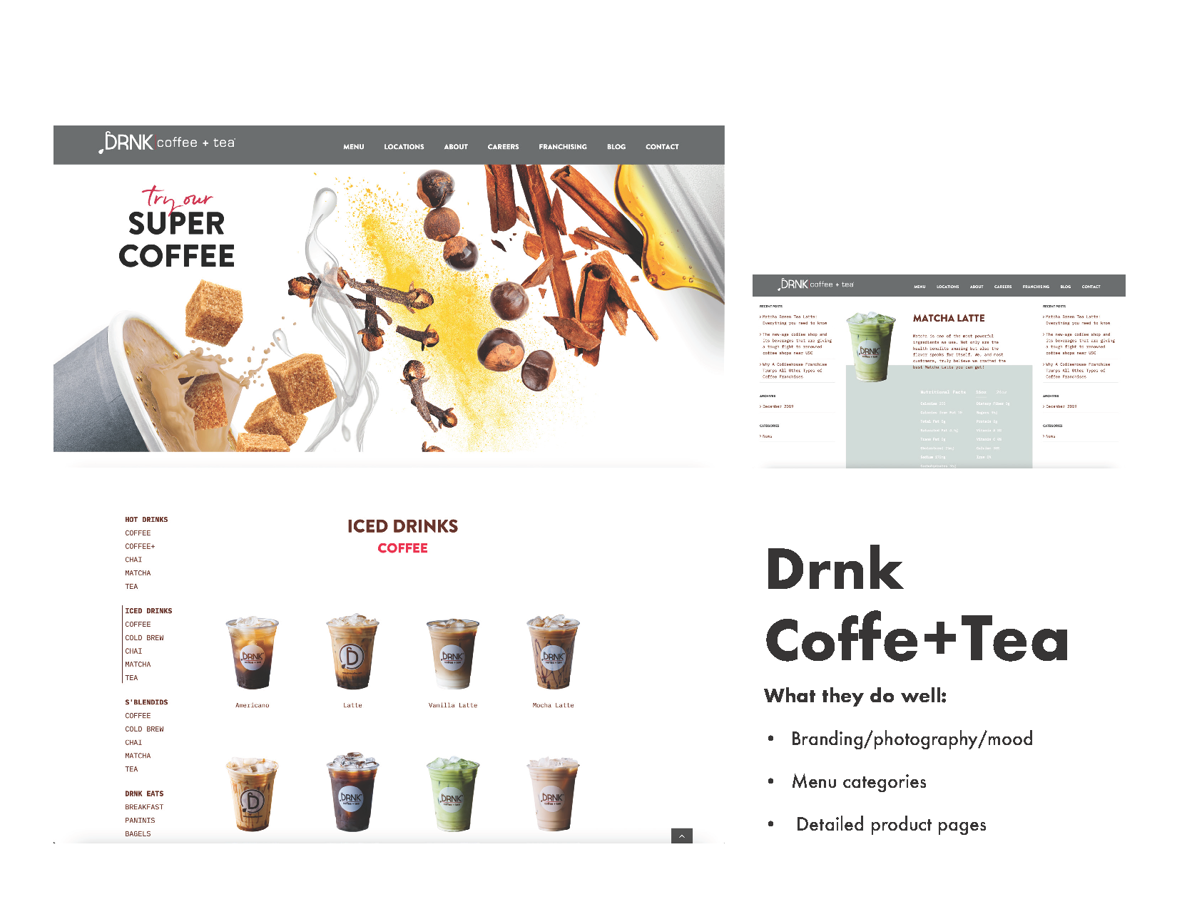
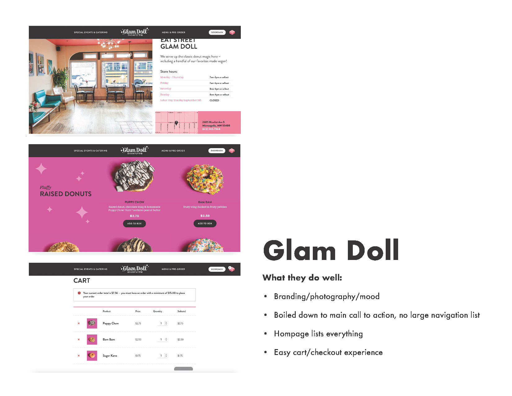
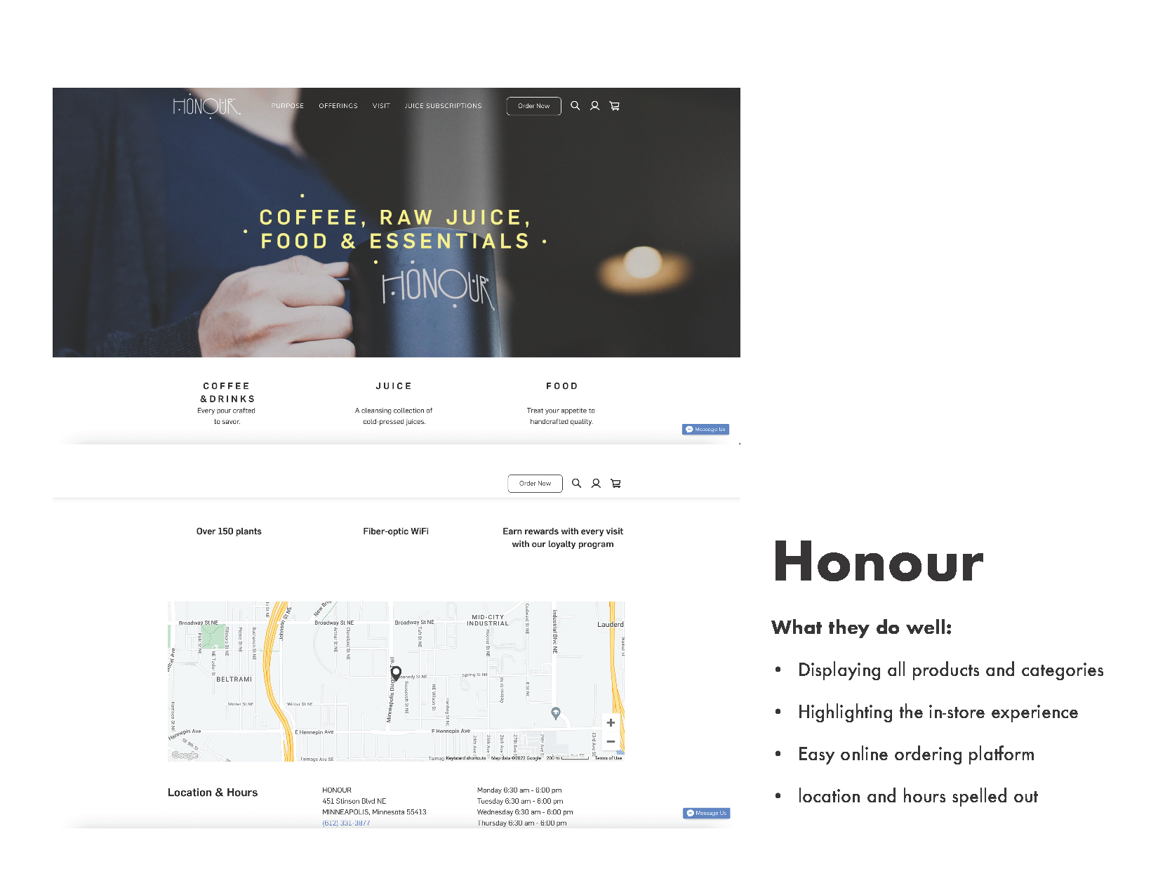
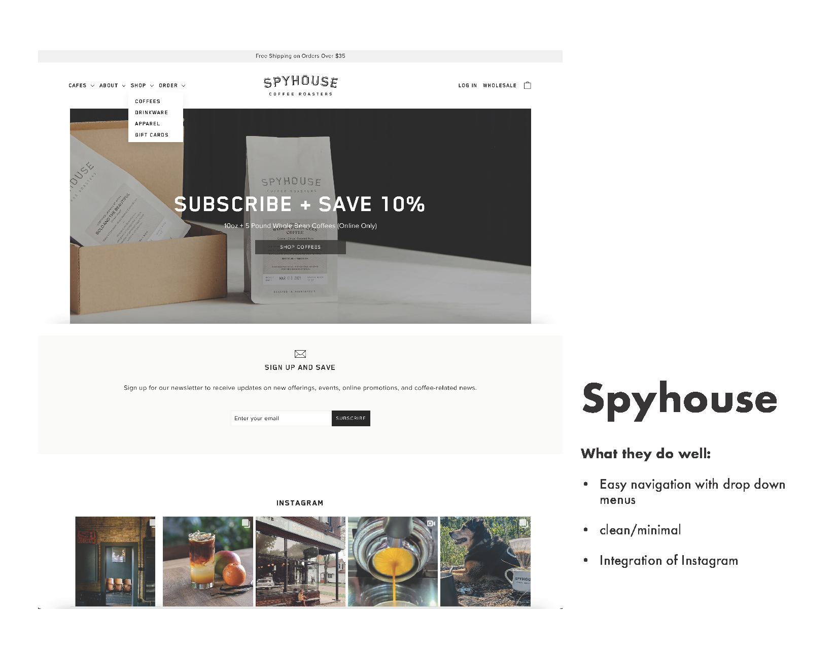
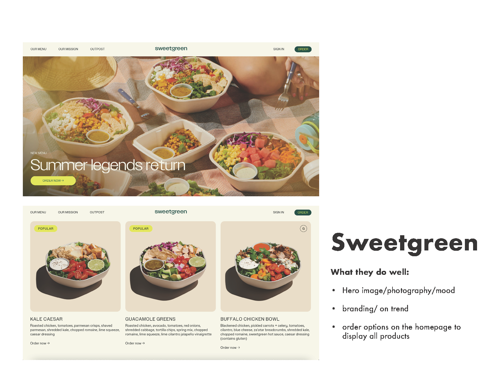
Comparing the competition: The current site was outdated, so it was crucial to keep up with the trends and produce something more evergreen. We looked to some of the competitors within the restaurant industry to take an audit of what they did well and what we want to make sure to avoid. Companies with similar pre-ordering operations included: Chipotle, Sweetgreen, Shake Shack, Spyhouse Coffee, and Glam Doll Donuts.


User needs:
- see menu
- find locations and hours
- contact
- gift cards
- donut schedule
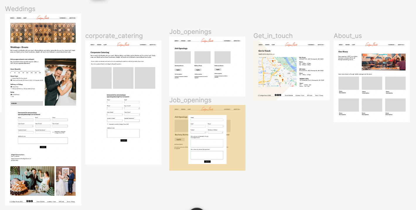
- weddings, events, and corporate catering
- sign-up for the newsletter
- shipping donuts
- ordering online (pickup and delivery)
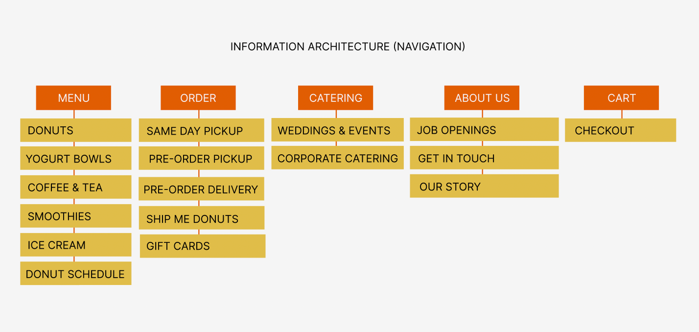
Information architecture
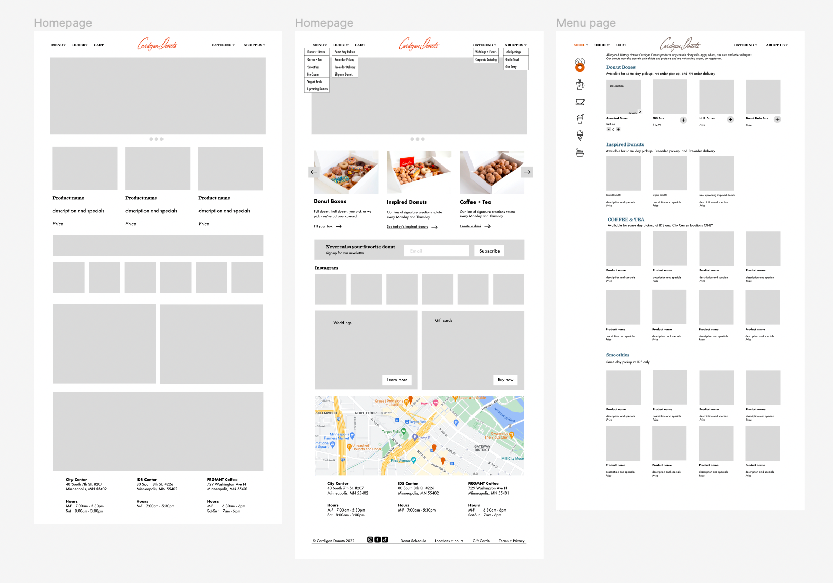
low-fidelity wireframes
low-fidelity wireframes
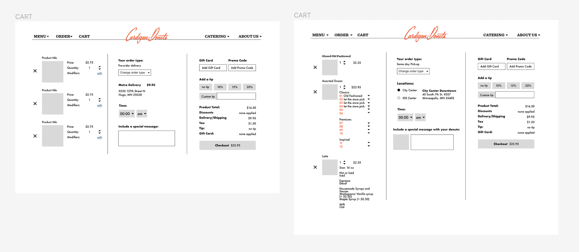
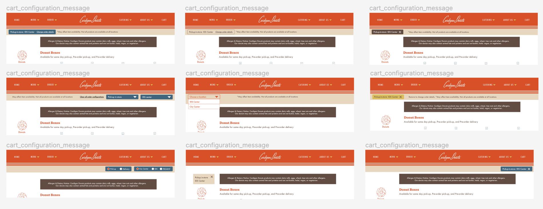
Cart wireframes
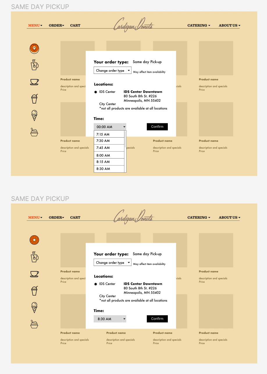
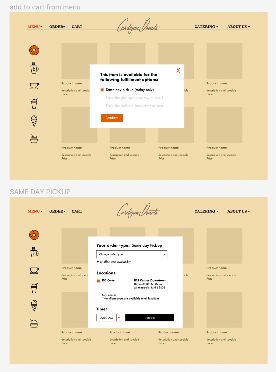
Cart Configurations: The biggest challenge was to create a seamless experience for users ordering online when there are multiple locations with different item availability at each, along with different abilities for order types.
- How might a user understand what items are available for which order type?
- How might a user know which location and order type they have configured?
- How might a user clear their cart after configuring it?
- How might a user order multiple items from different locations?
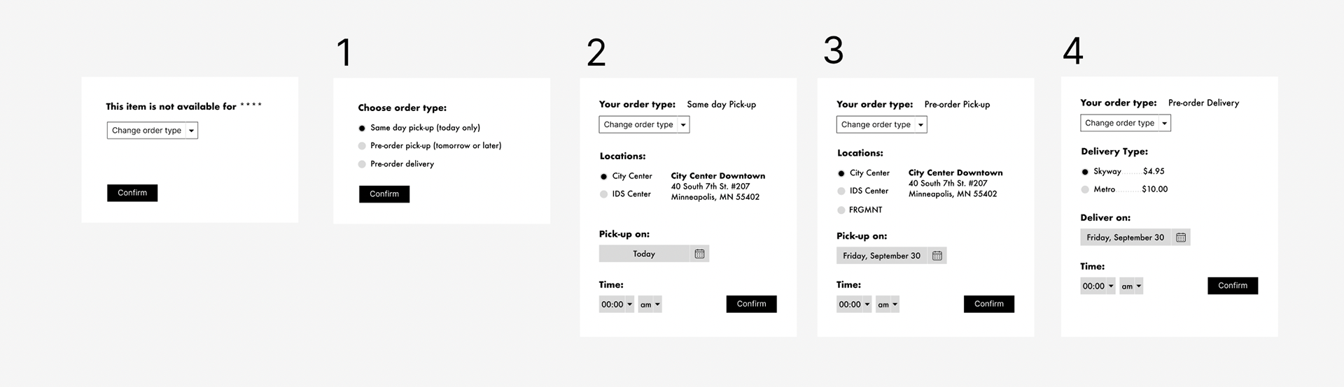
flow screens 3 & 4
flow screens 5 & 6
flow screens 1 & 2
Embodying the brand: Cardigan Donuts gives off a warm, cozy ambience. The website needed to completely represent what they stand for and reflect that same feeling of physically being in the store. One of the biggest changes coming with the re-design was that all the items would be displayed with the ability to add it to the cart to order. To make this possible, I facilitated a photoshoot of all products on a white sweep to ensure uniformity. The photos were edited and cropped before being placed in Square, which is where the product pull from to load into the website. The updated photos create a visceral and clean feel to the site, ensuring the brand's commitment to handcrafted comfort food, innovative flavors, and hospitality. A user will get the same experience as being in the store physically looking through the donut case.
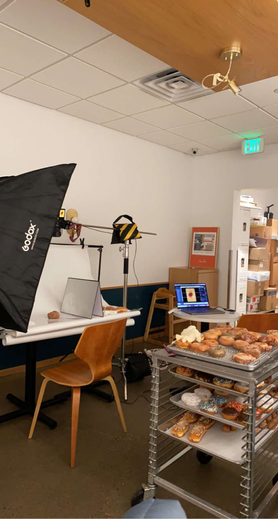
photoshoot set-up
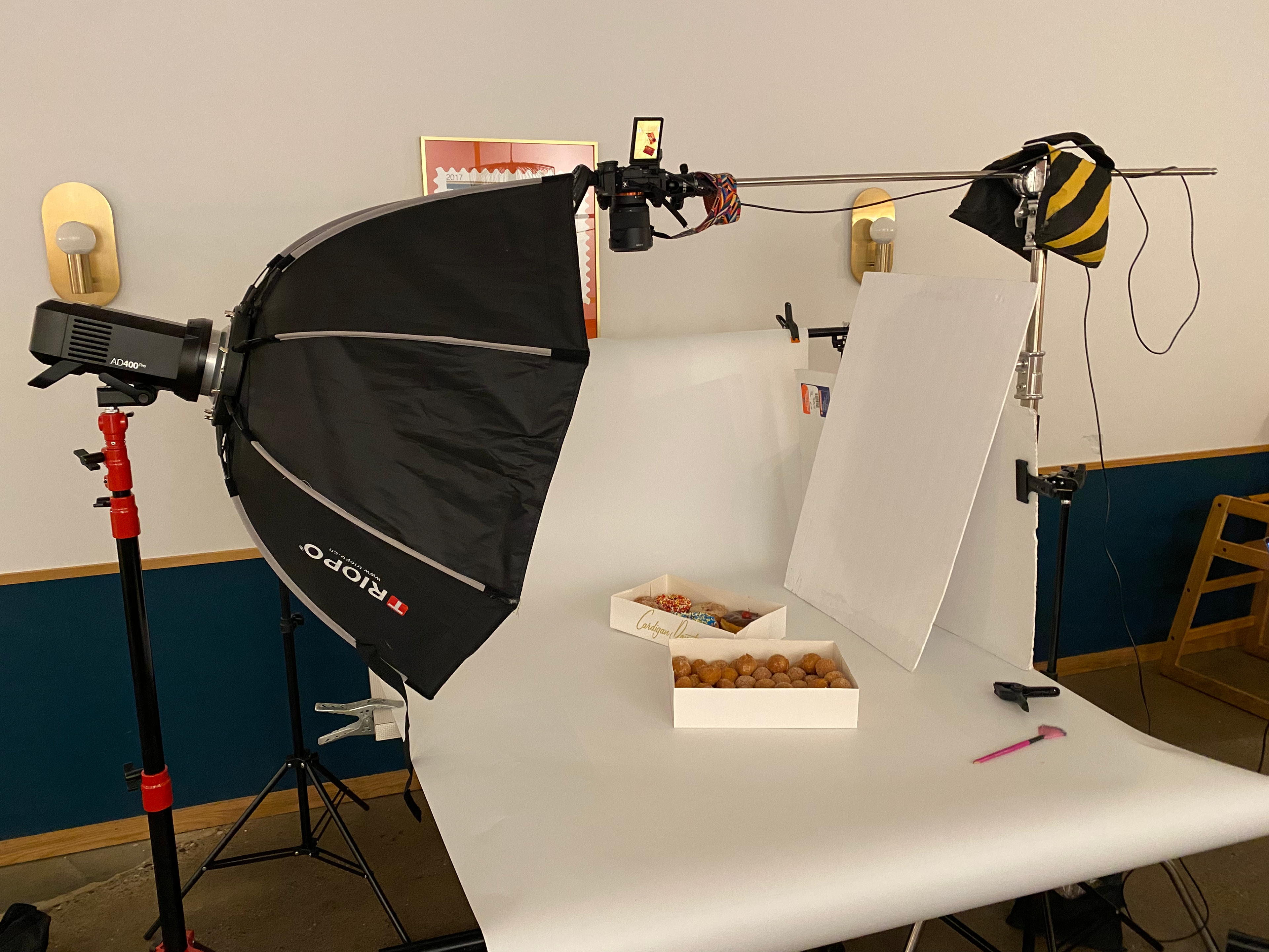
photoshoot set-up
Addressing Accessibility: With the brand developed before accessibility was in the forefront of web design applications, aspects of Cardigan Donuts' identity did not always pass guidelines. This meant we needed to bridge the gap between maintaining brand's integrity and shifting the angle to reach accessible parameters with colors, type, and patterns.
We made sure any text was always a minimum of 16 pt, darkened the brown, limit the use of text on backgrounds with low contrast, include alt and aria text for all images and buttons/links.
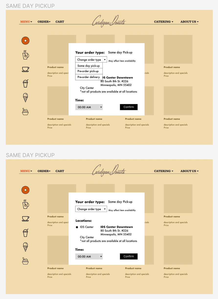
Feedback loops: Two main features that were in the ideation phase were the cart configuration banner and the buttons/tags on non-available items. After testing and talking with users about these elements of the process, we gathered insights about why they weren't working.
Some users did not even notice the banner or think it was interactive, rather they found it to be more informative. This led to color changes, higher contrast, and stronger indicators of interactivity such as arrows.
As item availability changes with each location, the flow of adding these items brought a lot of confusion. We didn't want to completely remove unavailable items so that users would still be aware of the products, but we needed to make it clear that they were not allowed to be added with the specific setting (order type). Several options were worked out, including a circular route back to changing the location/order type to include an item that may have otherwise been unavailable. We tested various copy for this tag and button ensuring users understood that it was inviting them to click and move through a new flow.
Cart configuration banner ideation
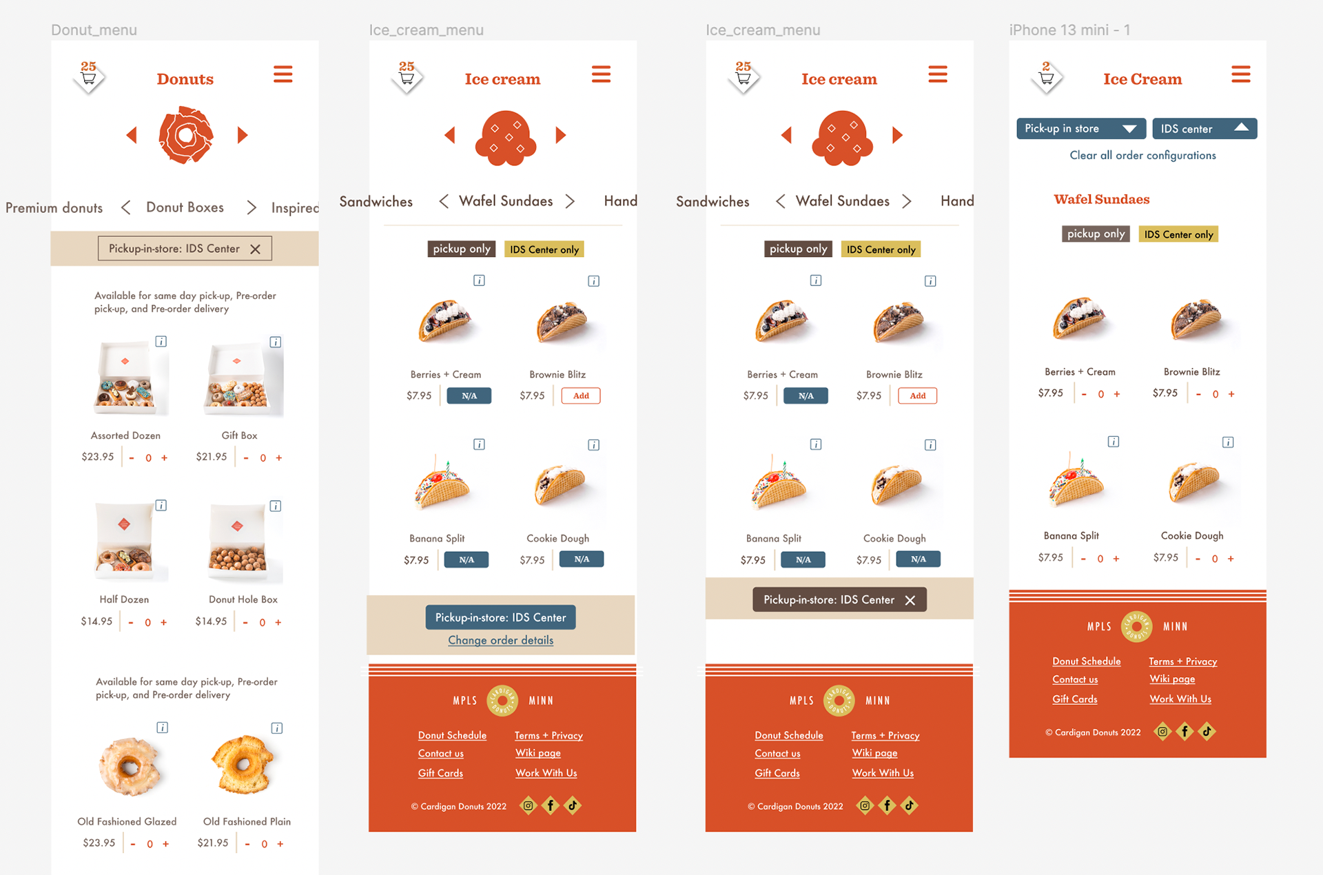
Cart configuration banner and non-available items on mobile
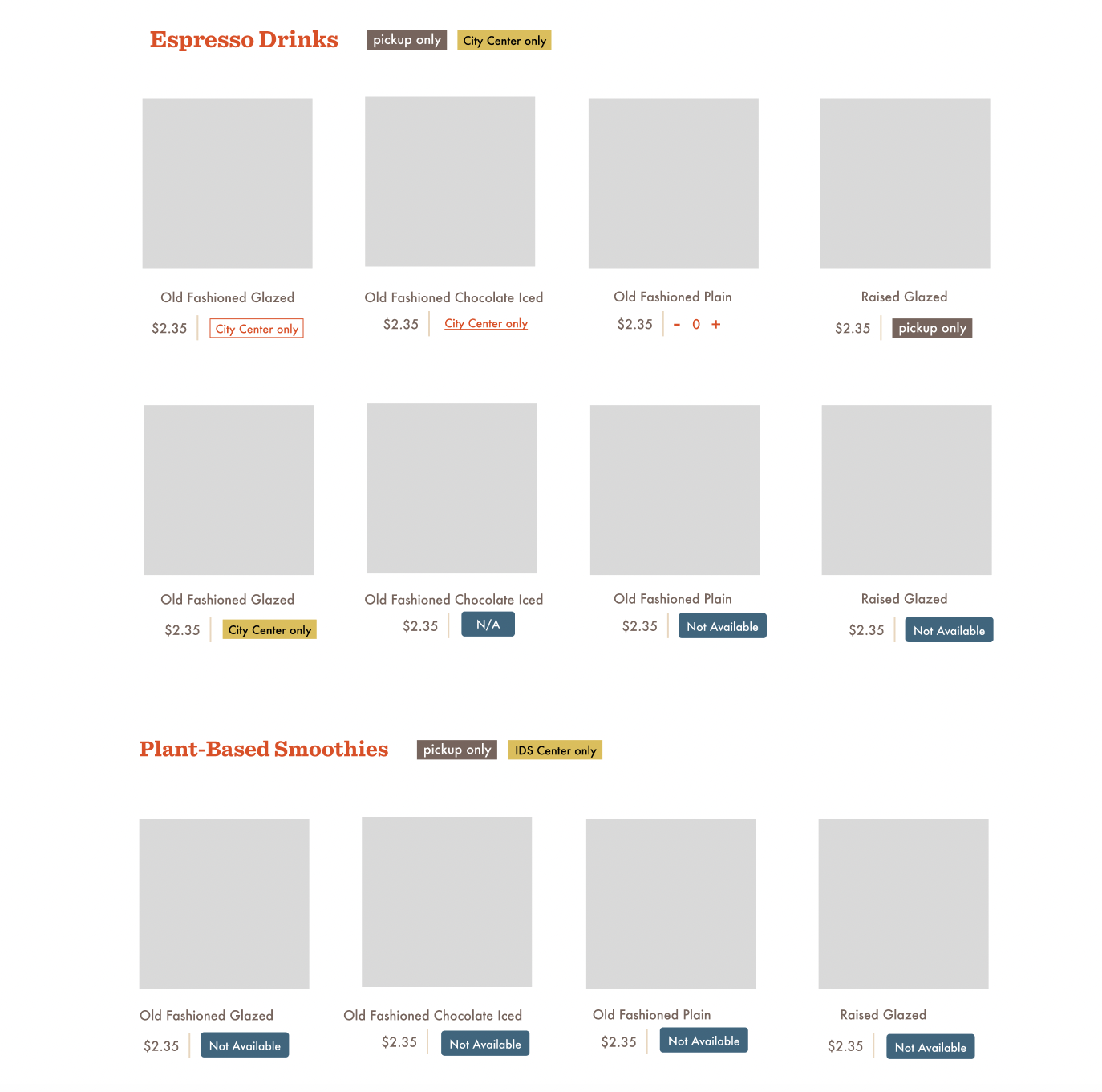
non-available item tag/button ideation
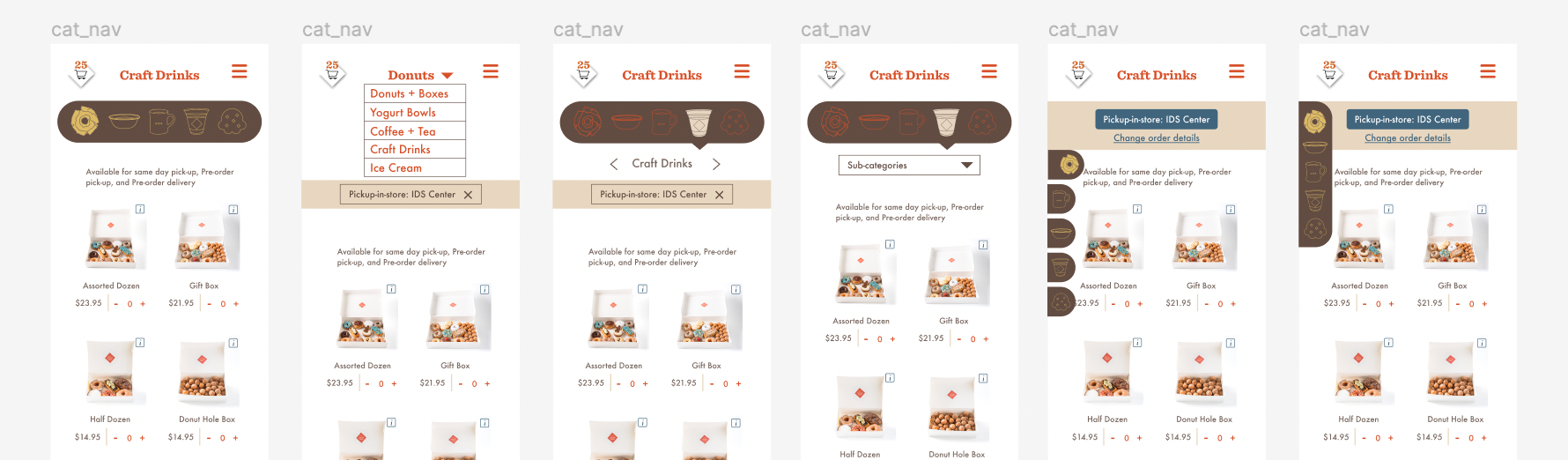
Category navigation for mobile
Launch and Learn: The website can be seen live at Cardigandonuts.com. After launching we continue to connect with users through surveys and additional interviews with specific cases/issues to solve.

Final Homepage mockup
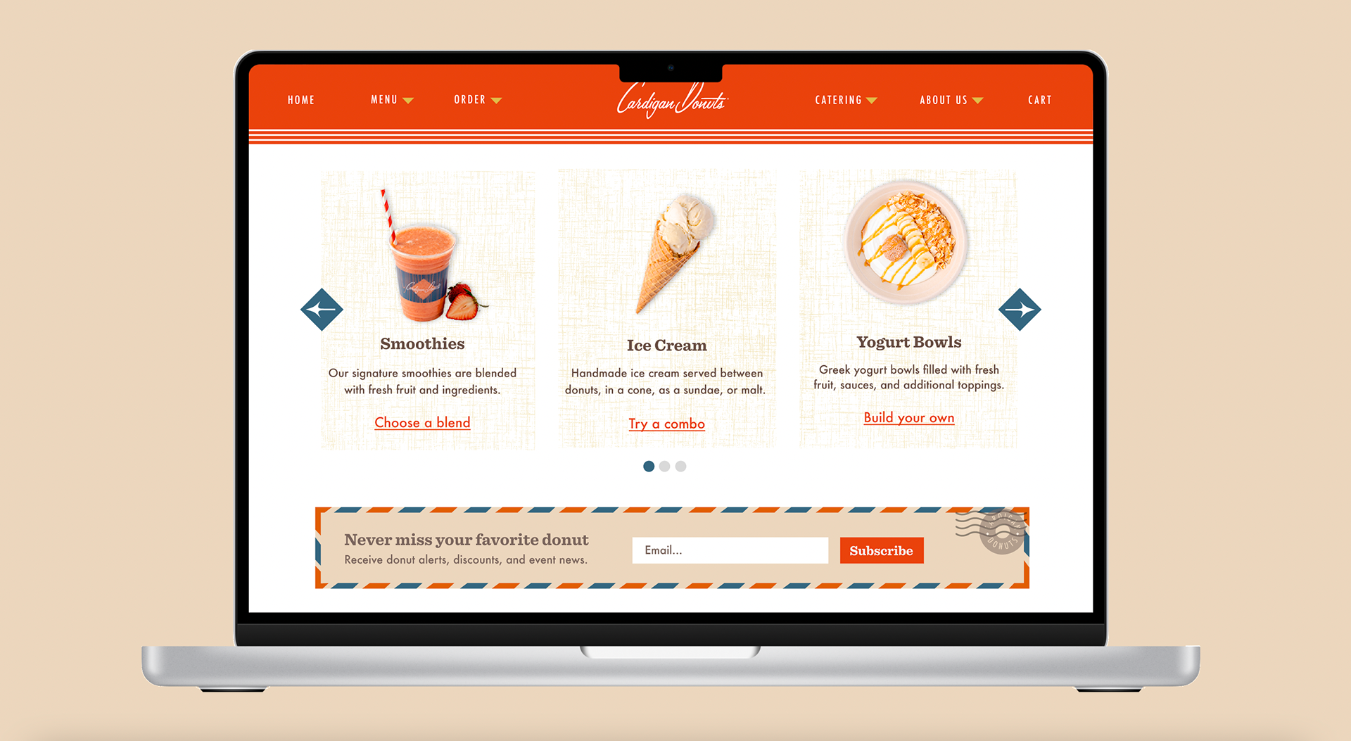
Final Homepage mockup

Final order type popup mockup
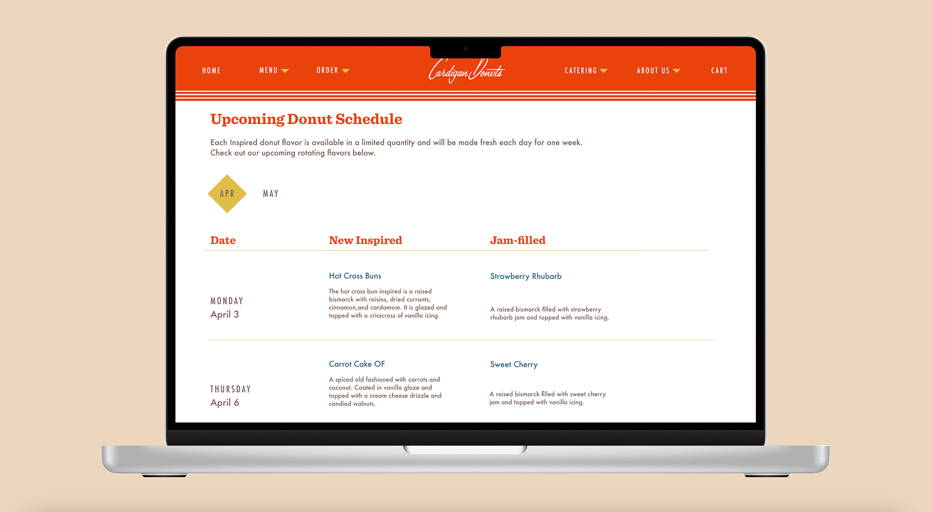
Final Upcoming donut schedule mockup

Final menu page mockup for mobile
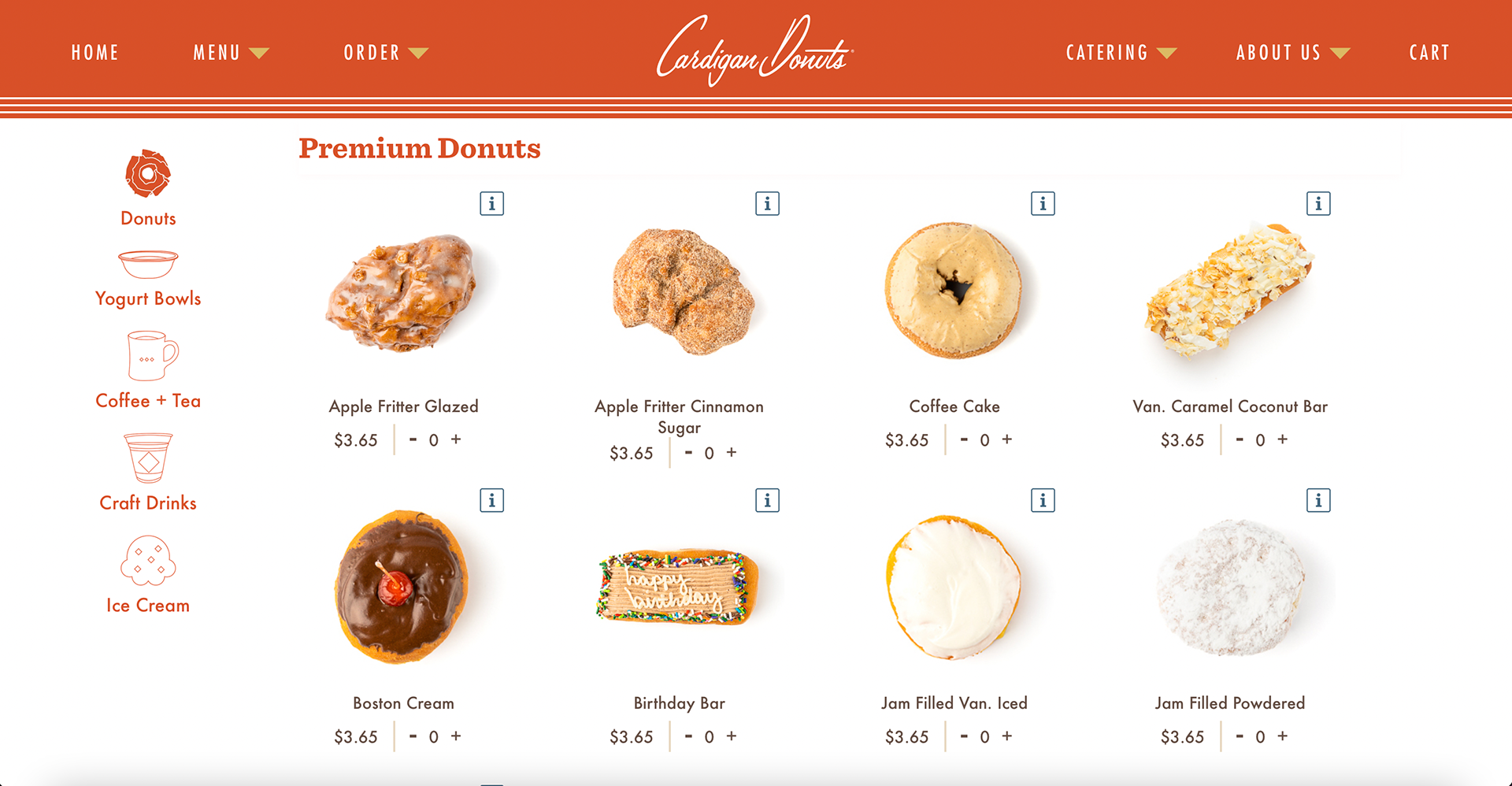
Screenshot from live website menu page
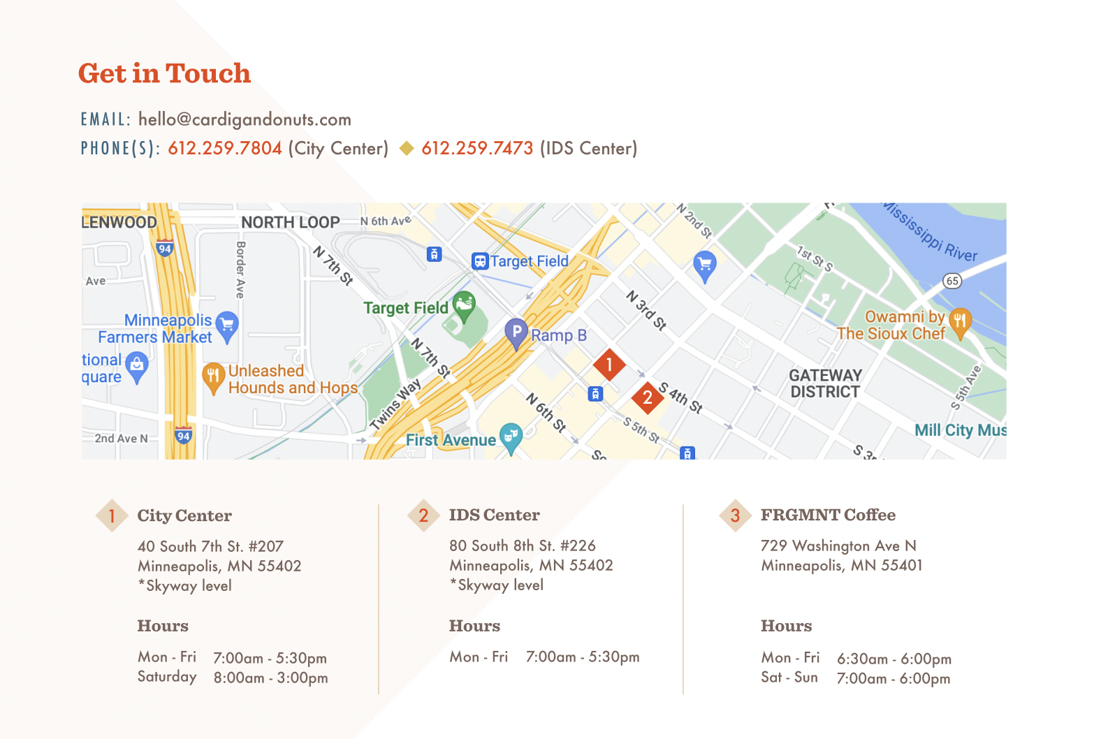
Get in touch page mockup
Live site walk through as of 5/13/23