

Objective: Take an existing company and re-design the brand. This was only a class project and not affiliated with the actual company.
After growing up going to Flips Gymnastics and and working there for years, I am pretty familiar with the atmosphere and clientele. How fun would it be fun to give it a refreshing look and feel?! The process began by simply observing the company and all its current brand elements, looking for equity and noting things to improve.
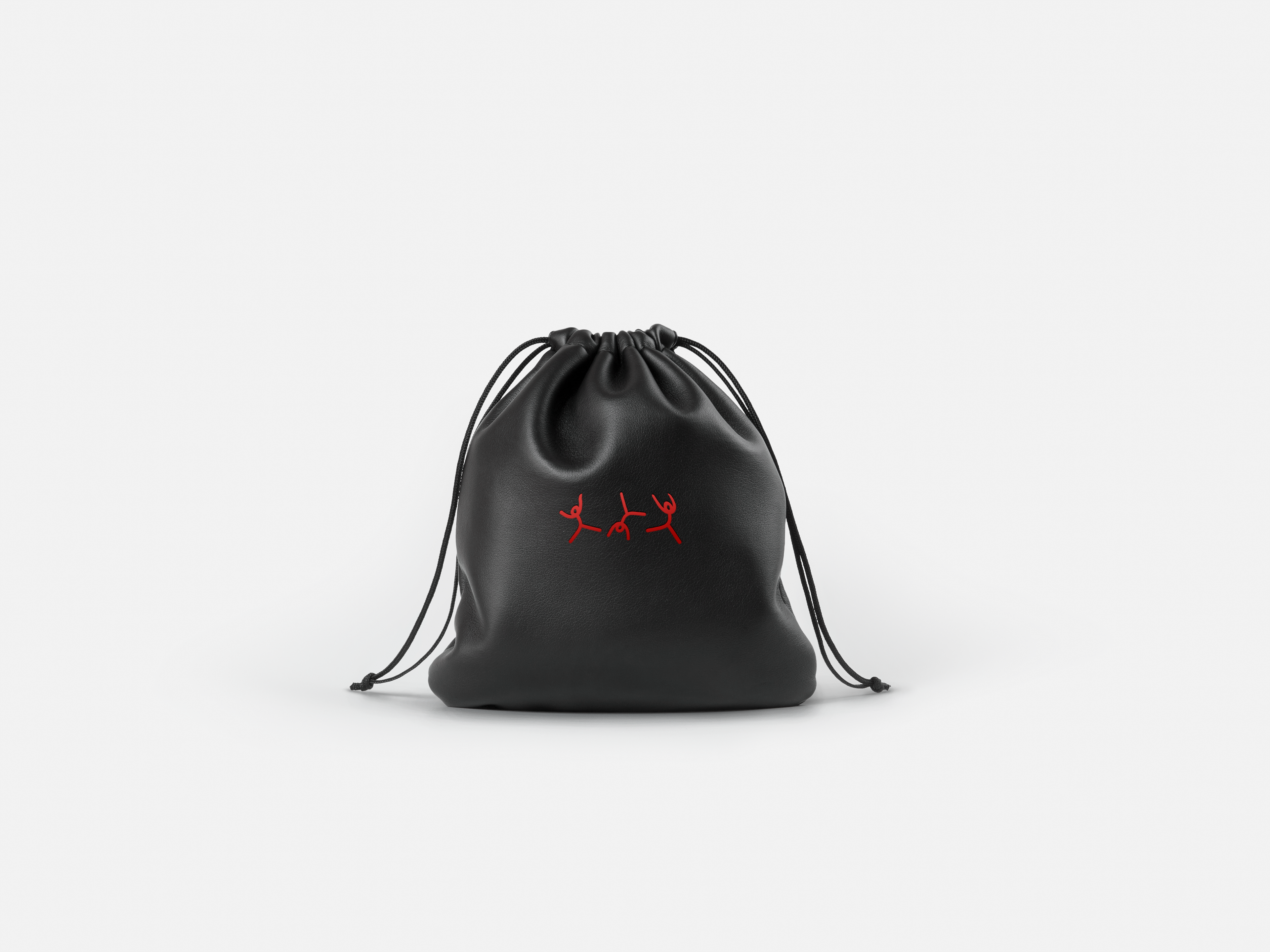
Starting with the logo, which is iconic to Flips, it was important to preserve the "i" flipping. Just simplifying and modernizing it.
Current logo

Re-designed logo
Initial stage: Next came icons and patterns. Taking inspiration from the loop in the logo to create the flipping figures. Both the logo ideation and icons were used to make patterns. This was a timely process of testing typefaces and spacing until I came up with the right logo. With the logo set and more flippy icons, time to start combining them.
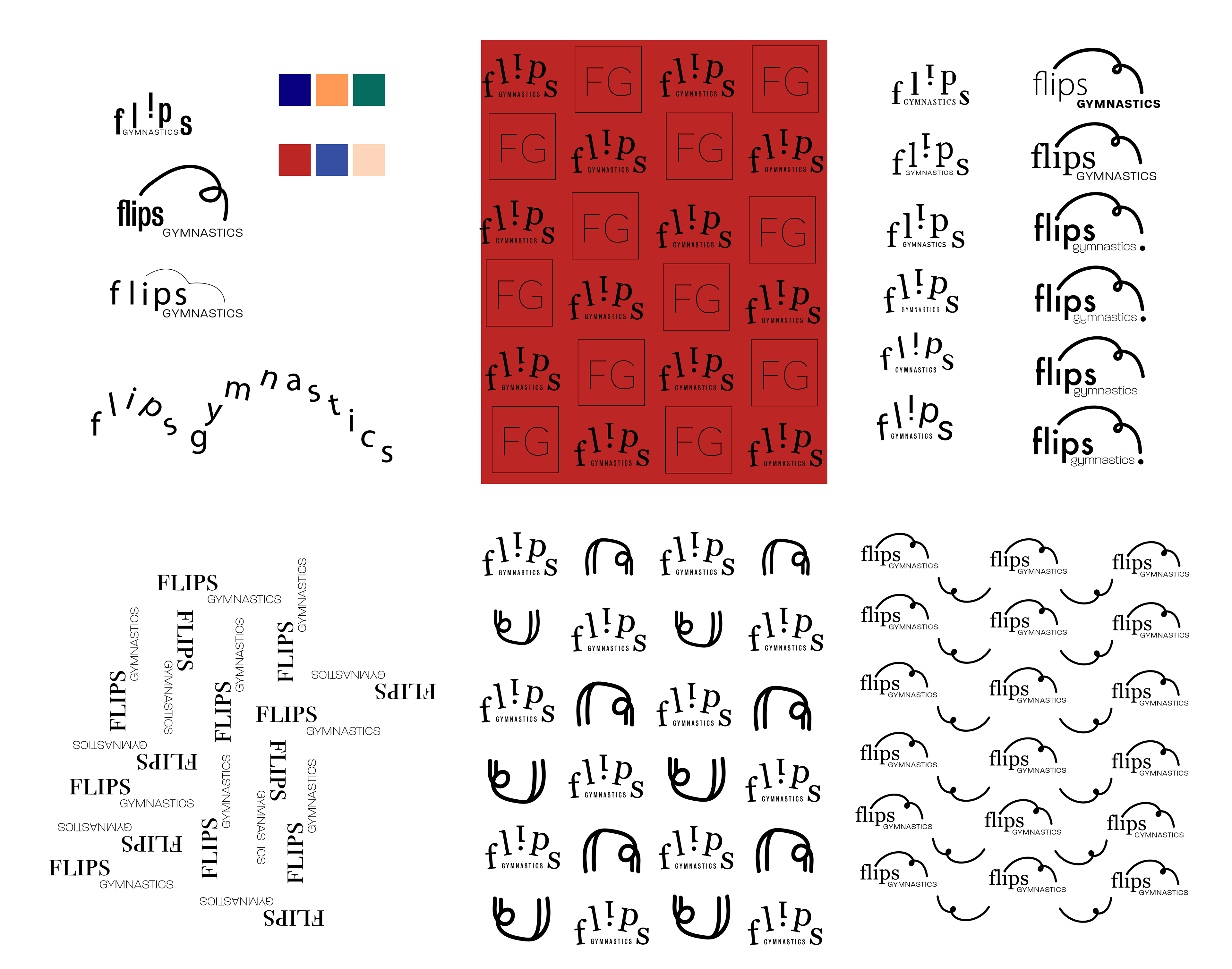
Logo and pattern ideation
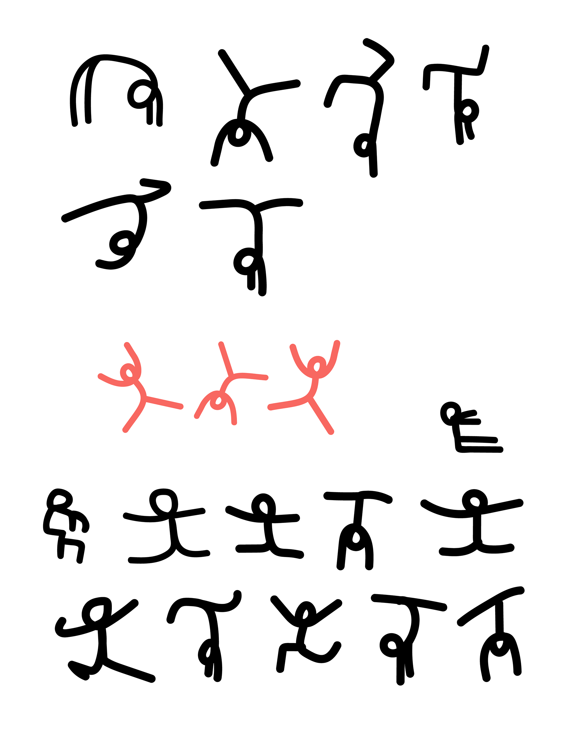
Icon characters
Application: Applying the new system to basic stationary such as business cards, letter heads, and envelopes tied everything together. Choosing a palette was a main struggle as the goal was to remain professional yet playful and welcoming to both children and parents. Capitalizing on a bold and colorful palette with the organic iconography, creates an inviting brand while building a more consistent, robust system.
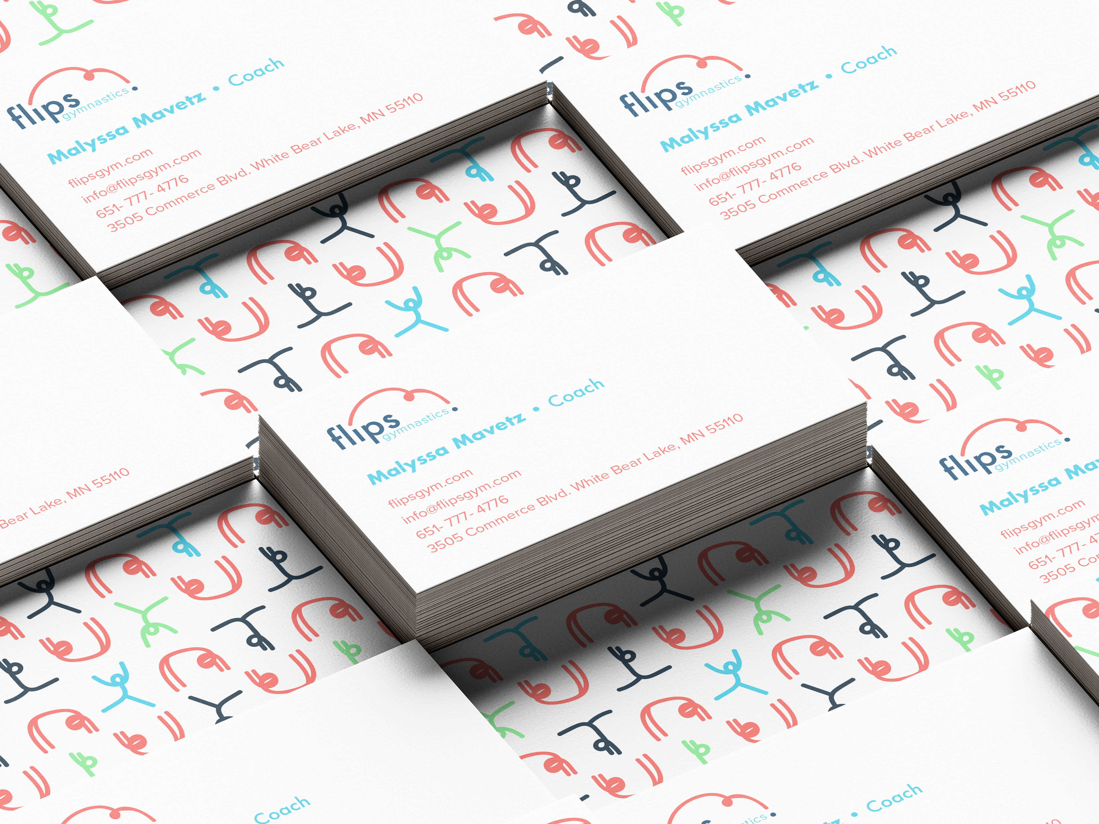
Business cards
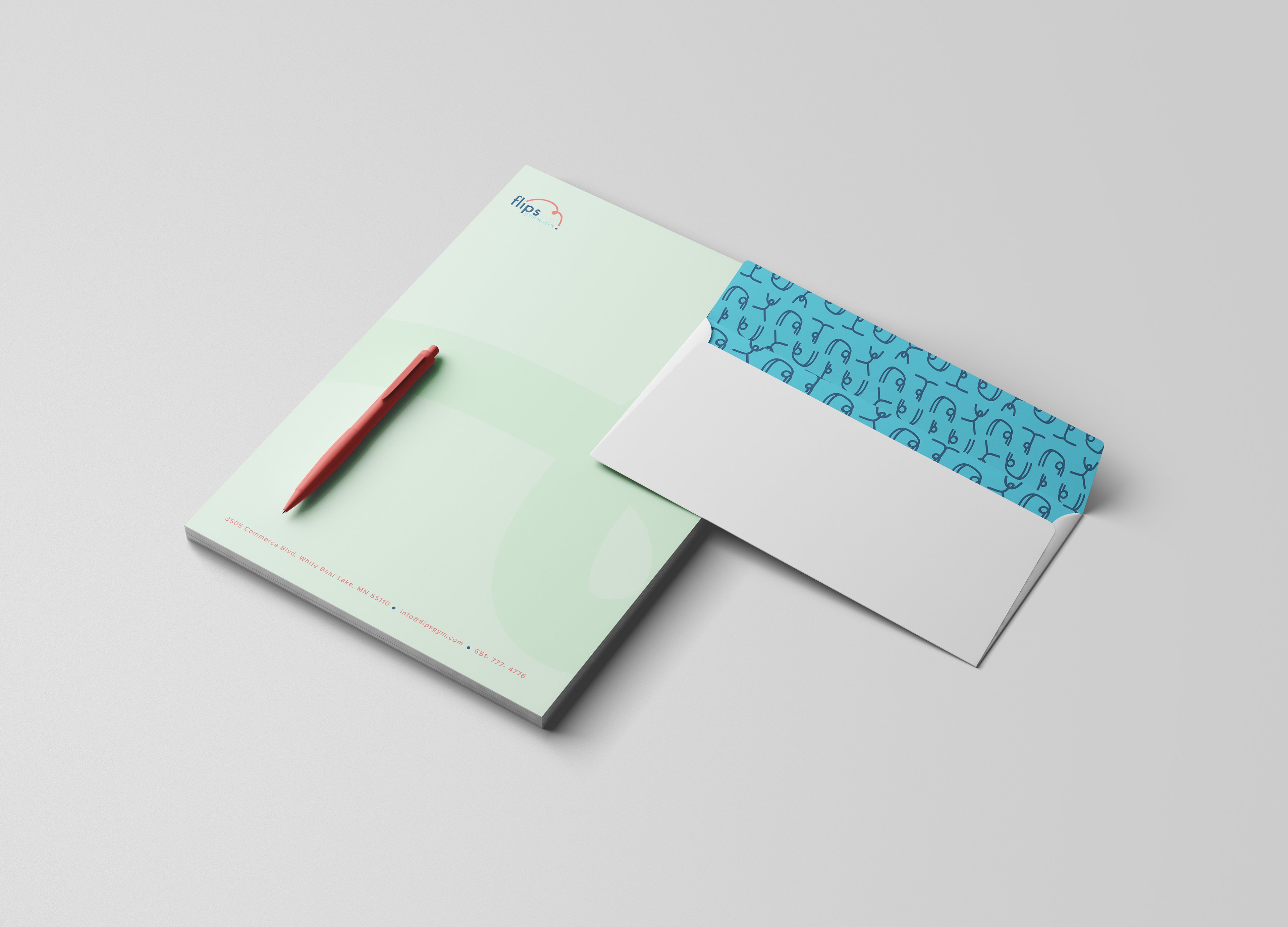
Letterhead and envelope
System expansion: As flips utilizes their website for information and functions for customers, updating to a modern, user-friendly look was a priority. Clean navigation, reduced imagery and information floating on every page, and organized architecture makes a much better user experience for customers looking to check information, sign-up, or pay. The pro-shop is home to leotards, clothes, and accessories to swag out all the kids.
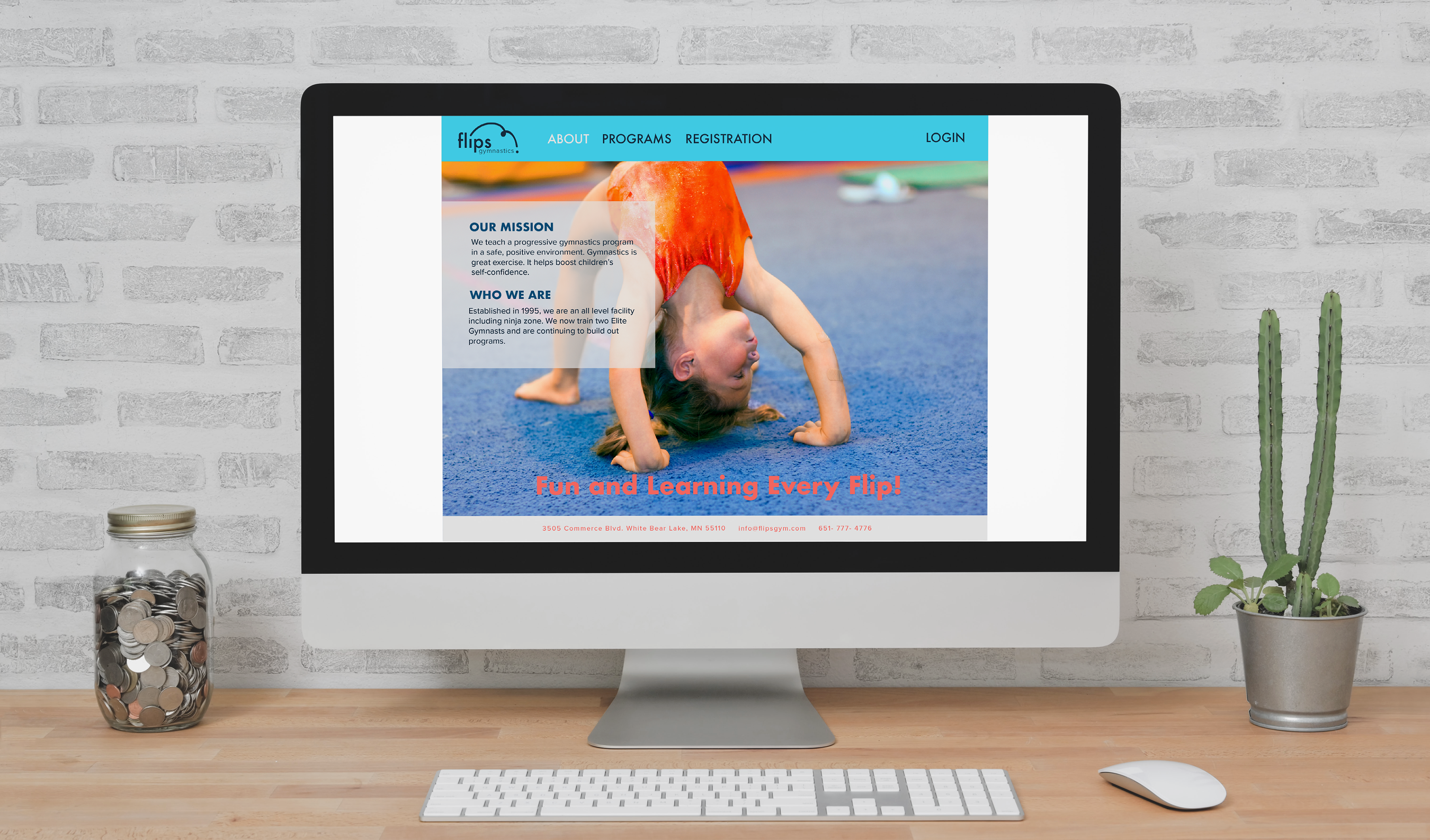
Website about page mockup
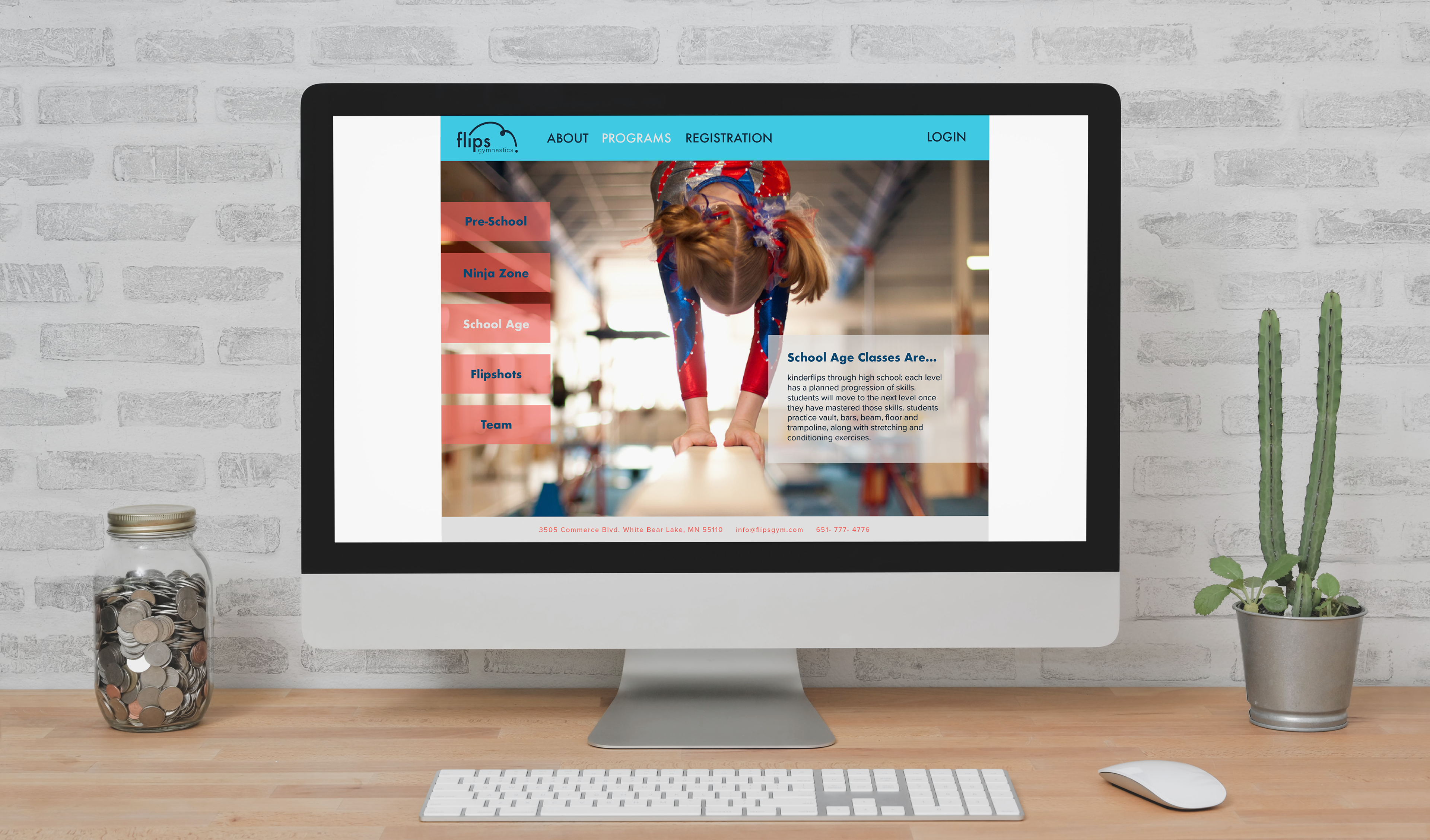
Website programs page mockup
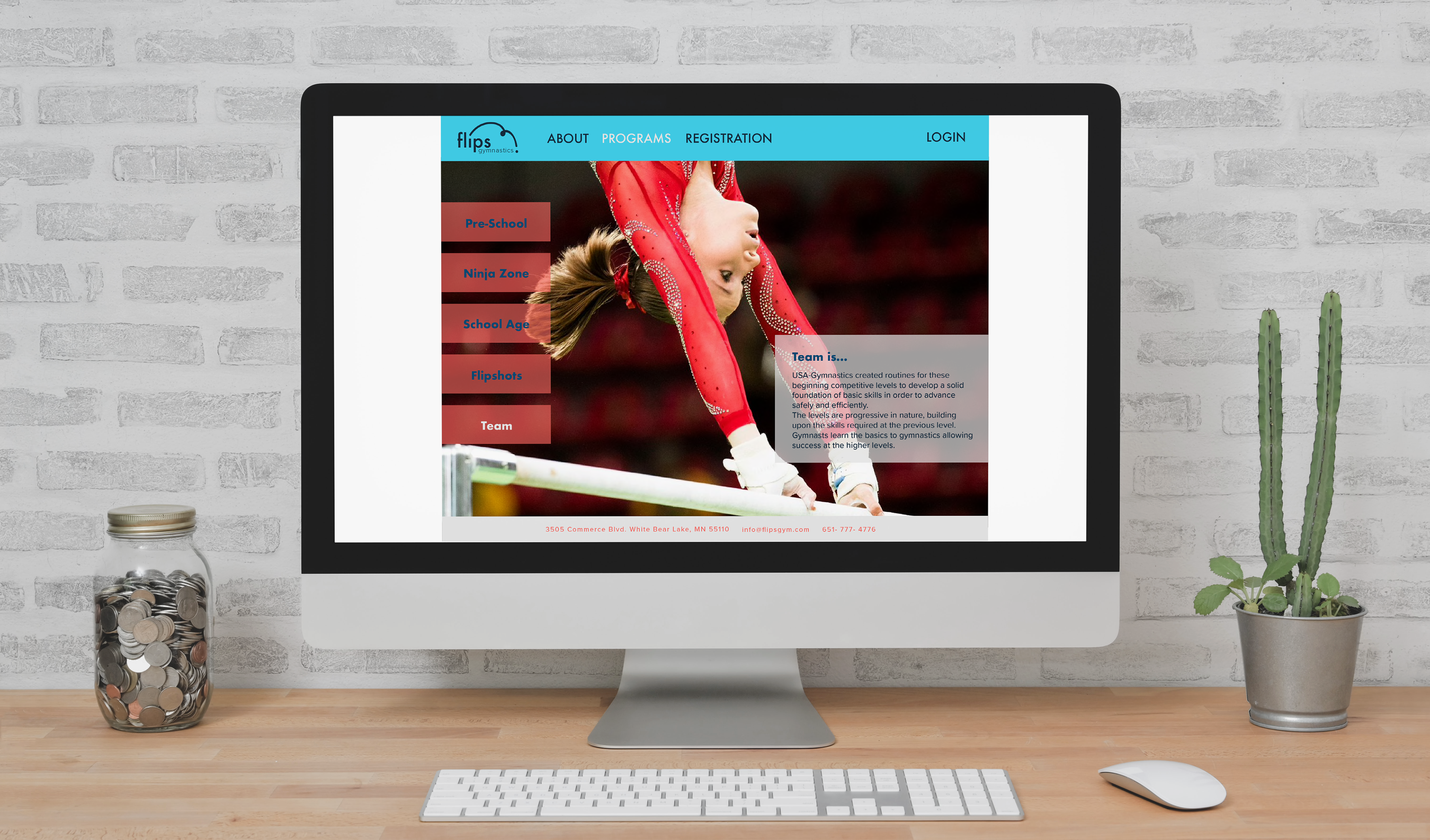
Website programs page mockup
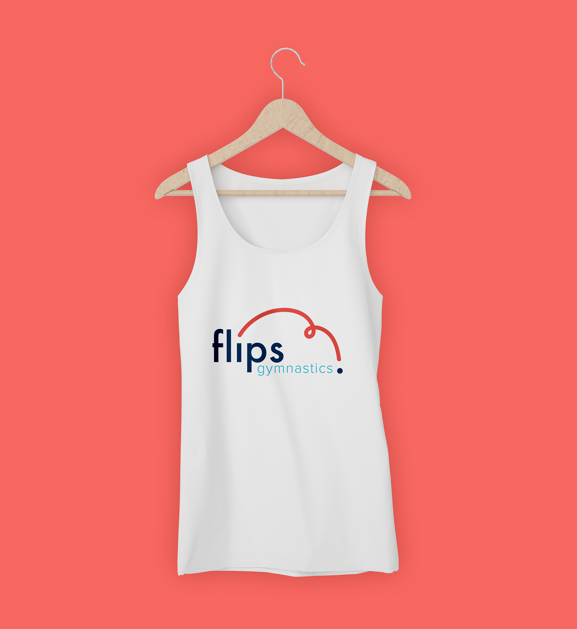
tank top mockup
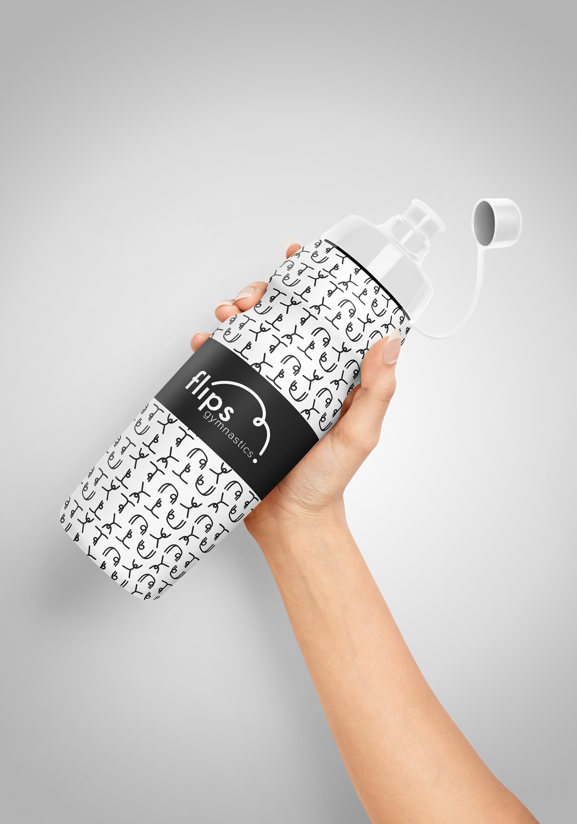
water bottle mockup